3 Mistakes to Avoid When Designing Your First SaaS Product
Designing your first SaaS product? These early-stage mistakes can kill clarity, overwhelm users, and hurt conversion. Here’s what to watch out for — and how to avoid them.
1. 🎯 Designing for Yourself (Instead of Your Users)
You're not the user.
Founders and teams often design for what they like, not what real users need.
🚫 Why it's a mistake:
- Skips user validation
- Assumes too much prior knowledge
- Ignores the real workflow pain points
✅ What to do instead:
- Talk to users early and often
- Let qualitative and quantitative feedback shape the UI
- Watch real usage, not just opinions
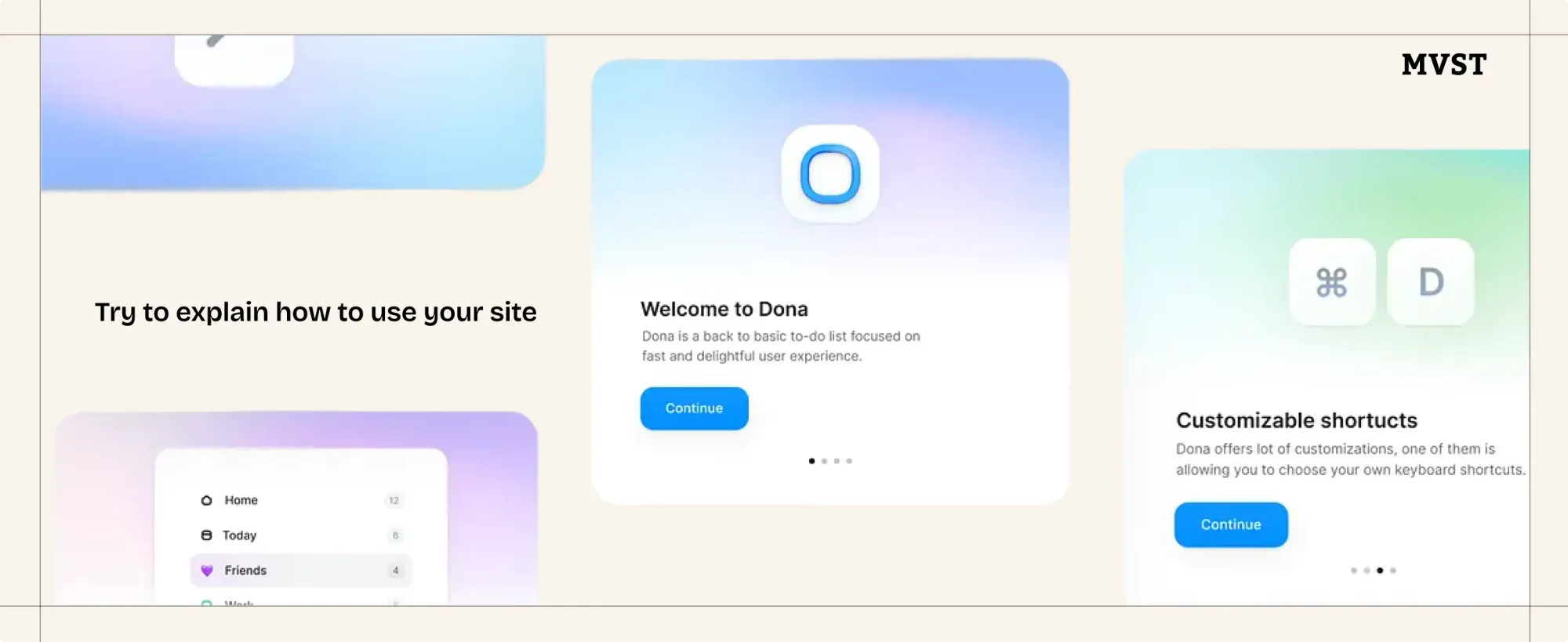
2. 🚪 Skipping Onboarding
No context = fast churn.
Users judge your product in the first few minutes, so don’t make them guess.
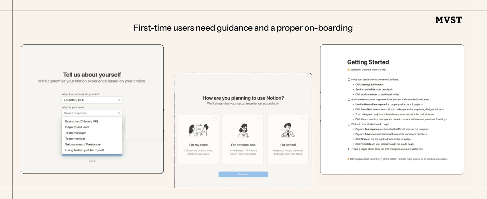
🚫 Why it’s a mistake:
- New users get lost or frustrated
- Feature value is never surfaced
- Creates friction when you need trust
✅ What to do instead:
- Use progress bars, checklists, or tooltips
- Offer optional guided tours
- Explain the value while the user takes action
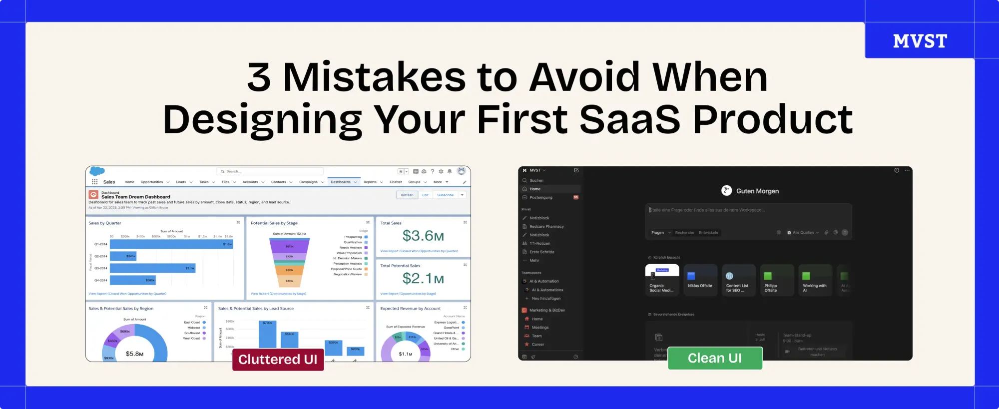
3. 🧱 Overloading the Interface with Features
More ≠ better.
Trying to “prove value” with lots of features? You might just confuse users.
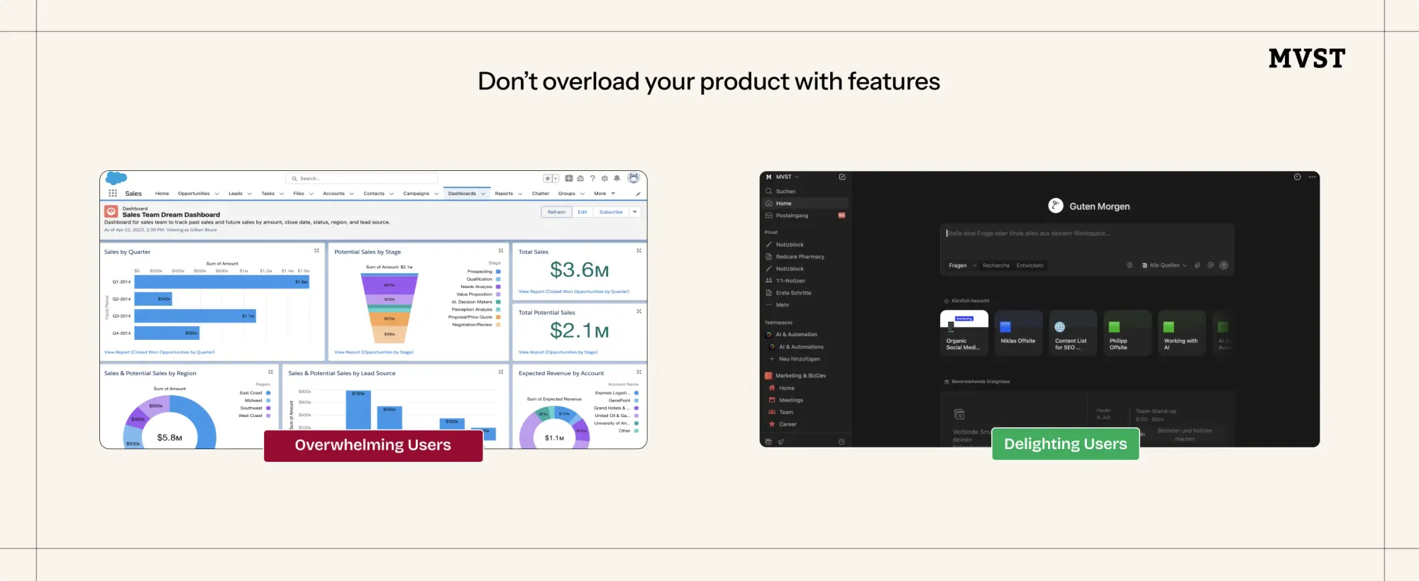
🚫 Why it’s a mistake:
- Dilutes your product’s main purpose
- Makes UI harder to navigate
- Slows down onboarding and retention
✅ What to do instead:
- Start with one clear job-to-be-done
- Design around that task first
- Only add features once real users ask for them
Want to Build SaaS Products Users Understand Fast?

We turn product ideas into conversion-ready SaaS tools - with smart UX, not feature overload.
👉 Let’s build your first SaaS product
Newsroom Ideas, Design & Technology in Motion
Practical insights on AI integration, headless e-commerce, UX/UI design, and digital product development. Case studies, implementation guides, and expert perspectives from the MVST team in Munich and Barcelona.
Barrierefreiheit durch Farbkontrast meistern: Das unverzichtbare Toolkit für Designer
Ghida El BadriMay 27, 2026
Welcome to MVST, Ahmed Mahfoudhi
Ghida El BadriMay 15, 2026
Welcome to MVST, Melker
Ghida El BadriMay 15, 2026