Mastering Accessibility with Color Contrast: A Designer's Essential Toolkit
Color contrast isn't just about aesthetics—it's a critical factor in making digital content accessible to everyone. Ensuring adequate color contrast significantly enhances readability and usability for users with visual impairments and is a must for your product to be accessible.
Why Color Contrast is Crucial
- Enhanced Readability: High contrast between text and background colors improves legibility, making content easier to read for users with low vision or color deficiencies.
- Improved Usability: Clear contrast between interactive elements ensures that users can easily identify and navigate buttons, links, and form fields within interfaces.
- Promotion of Inclusivity: By prioritizing color contrast, designers create digital experiences that are accessible to everyone, fostering inclusivity and equal access to information.
Practical Tips for Implementation
- Adhere to Standards: Familiarize yourself with the Web Content Accessibility Guidelines (WCAG) and ensure that your designs meet the recommended minimum contrast ratios for text and interactive elements.
- Utilize Tools: Leverage online color contrast checkers and accessibility evaluation tools to assess and adjust the contrast levels in your designs.
- Conduct Thorough Testing: Test your designs across different devices, screen sizes, and lighting conditions to verify that color contrast remains effective in various contexts.
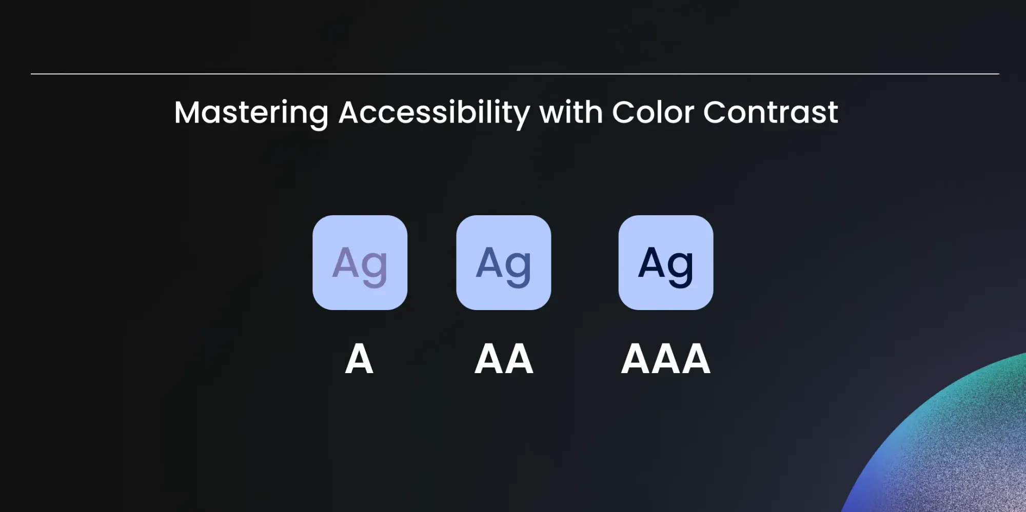
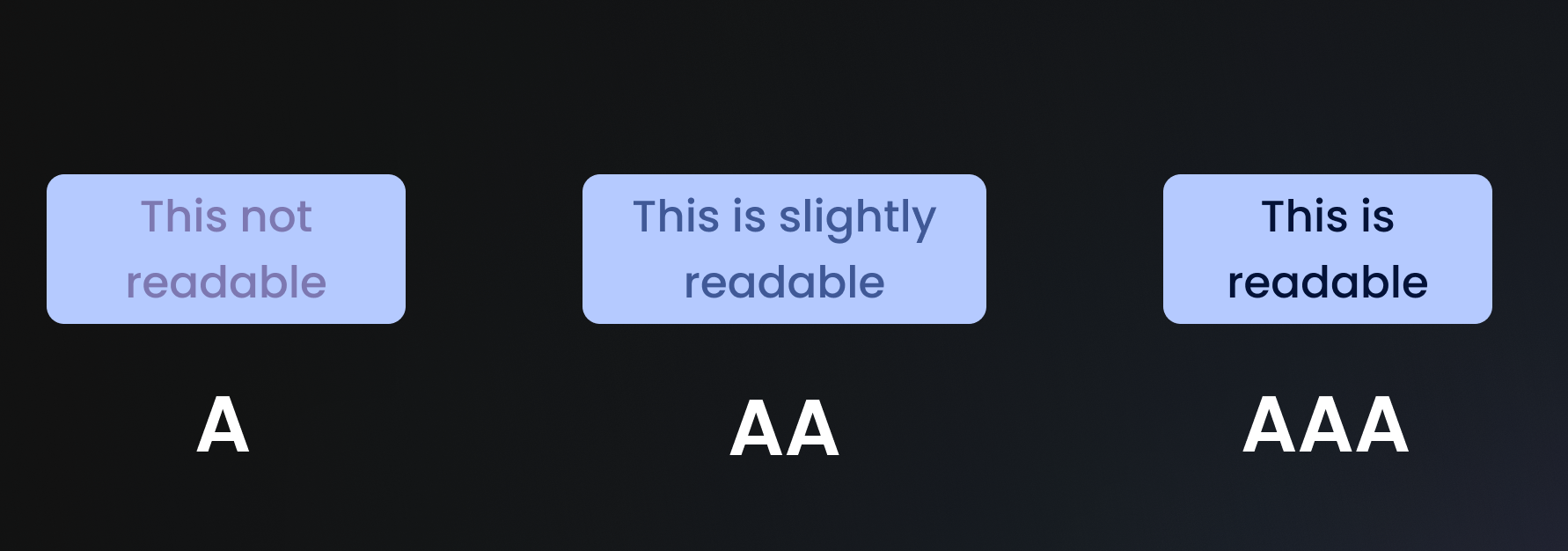
WCAG Contrast Ratio Requirements
WCAG defines specific minimum contrast ratios depending on the compliance level you're targeting:
| Element | WCAG AA | WCAG AAA |
|---|---|---|
| Normal text | 4.5:1 | 7:1 |
| Large text (18pt+ or 14pt bold) | 3:1 | 4.5:1 |
| UI components & icons | 3:1 | 3:1 |
AA is the standard requirement for most digital products. AAA is best practice for products where accessibility is critical - healthcare apps, government platforms, financial tools.
Tools to Check and Fix Contrast
These are the most reliable tools for testing contrast in your designs:
- Contrast Checker (WebAIM) - the industry standard. Paste two hex values and get an instant AA/AAA pass or fail. Free.
- Stark - Figma and Sketch plugin. Tests contrast directly inside your design tool without exporting. Paid with a free tier.
- Adobe Color - has a dedicated accessibility mode that checks contrast and flags colour-blind issues simultaneously. Free.
- Chrome DevTools - built into the browser. Inspect any element and the colour picker shows the contrast ratio live. Free.
Common Mistakes to Avoid
- Relying on colour alone to convey meaning - a red error state is invisible to users with red-green colour blindness. Always pair colour with an icon or text label.
- Assuming light grey on white is fine - it rarely passes AA. Light grey (
#999999) on white (#FFFFFF) is only 2.85:1 - a fail at every level. - Forgetting placeholder text - input field placeholders are often styled with low contrast and overlooked in audits. They need to meet the same 4.5:1 ratio.
- Testing in isolation - always test contrast in context, not just in a colour swatch. Background images, gradients, and overlapping elements all affect the real contrast ratio.
- Only testing for AA - if you're building for healthcare, government, or financial services in Germany, check whether your product falls under the EU Accessibility Act 2025, which mandates compliance by June 2025.
A thoughtful approach to color contrast empowers all users to engage with your content, fostering inclusivity and accessibility.
For the full breakdown of WCAG principles and compliance levels, read our guide on What is Accessibility and WCAG.
Newsroom Ideas, Design & Technology in Motion
Practical insights on AI integration, headless e-commerce, UX/UI design, and digital product development. Case studies, implementation guides, and expert perspectives from the MVST team in Munich and Barcelona.

Welcome to MVST, Marc Fermín
Ghida El BadriJun 29, 2026
Welcome to MVST, Victor Carmona Aliu
Ghida El BadriJun 29, 2026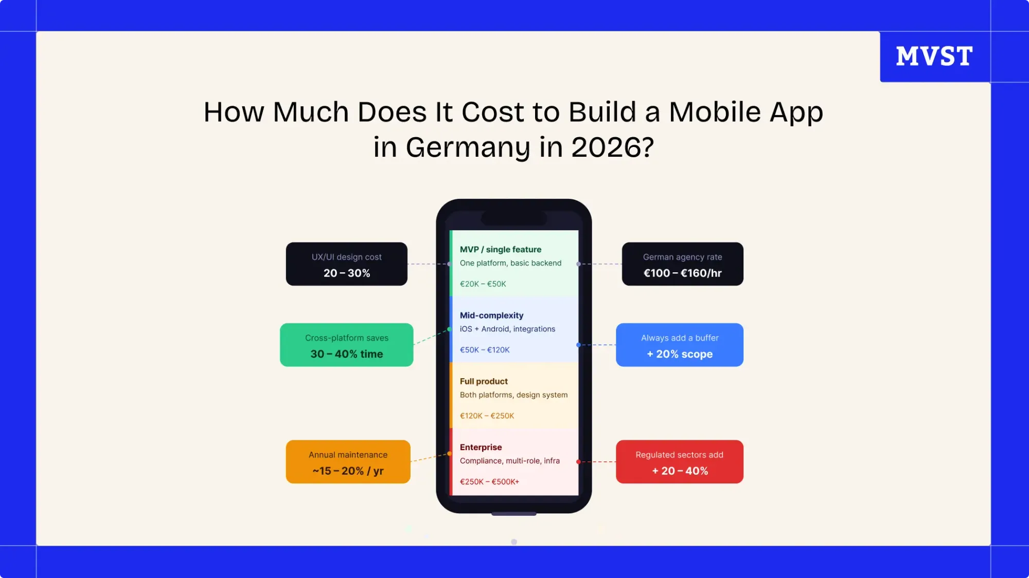
How Much Does It Cost to Build a Mobile App in Germany in 2026?
Ghida El BadriJun 17, 2026