3 UI Trends That Are Actually Useful (Not Just Pretty)
Some UI trends look great in mockups but totally fall apart in real products. These three trends? They're not just aesthetic. They actually make your product easier to use, scale, and trust.
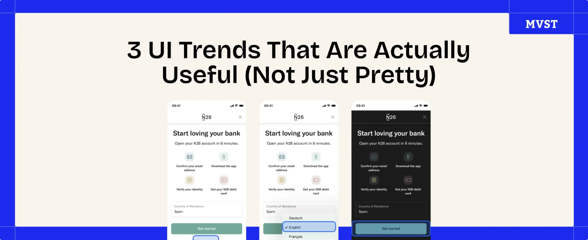
1. 🧠 Progressive Disclosure
“Show less. Then more.”
This pattern lets users start simple, and dig deeper only when they need to. It avoids overwhelming them, especially in complex workflows.
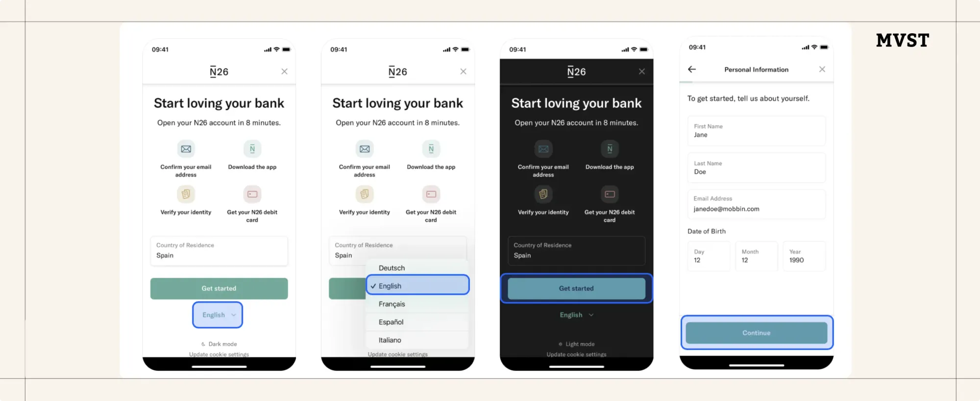
✅ Why it works:
- Reduces cognitive load
- Improves onboarding and task focus
- Makes advanced features feel less intimidating
🔍 Where to use it:
- Pricing flows
- Dashboards
- Multi-step setup screens
2. ⚡️ Microinteractions for Feedback
“Clarity over silence.”
Tiny UI reactions (like showing loading, success, or error states) make users feel like the system is responsive, reliable, and human.
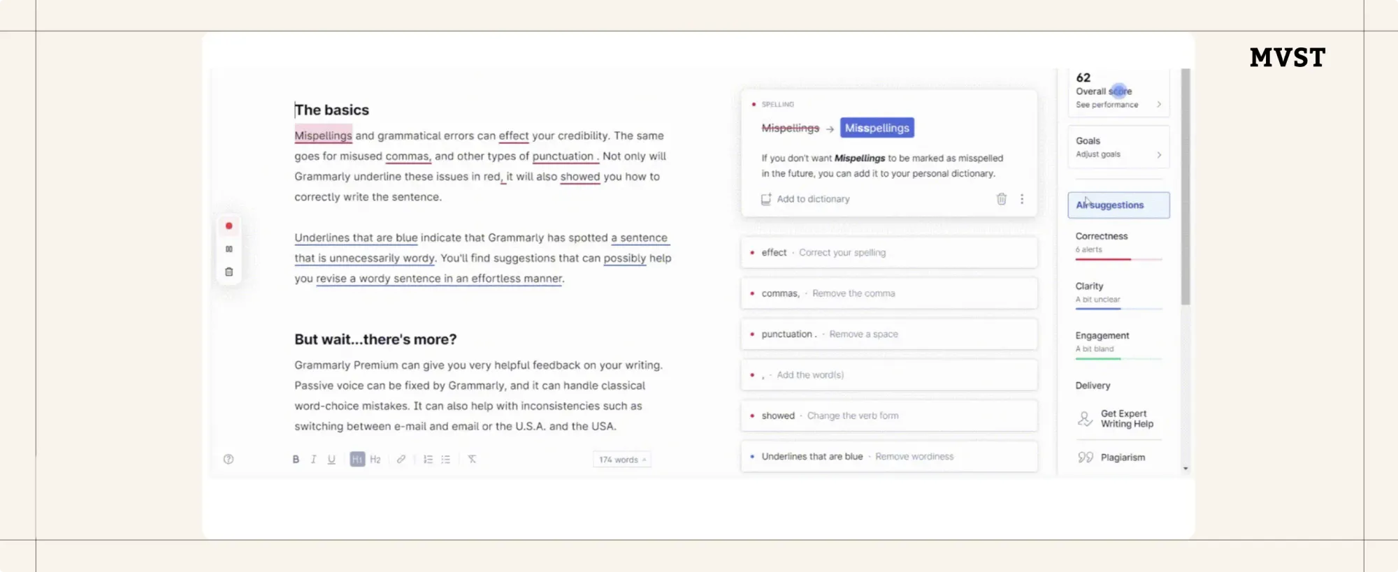
✅ Why it works:
- Shows progress instantly
- Highlights successes and errors clearly
- Builds trust in the system
🔍 Where to use it:
- Forms & validations
- Upload flows
- Button states and toggles
3. 🧩 Adaptive Design Systems
“Design for different needs, not just devices.”
Adaptive systems tailor the UI based on user role, device type, or context, making complexity feel simple.
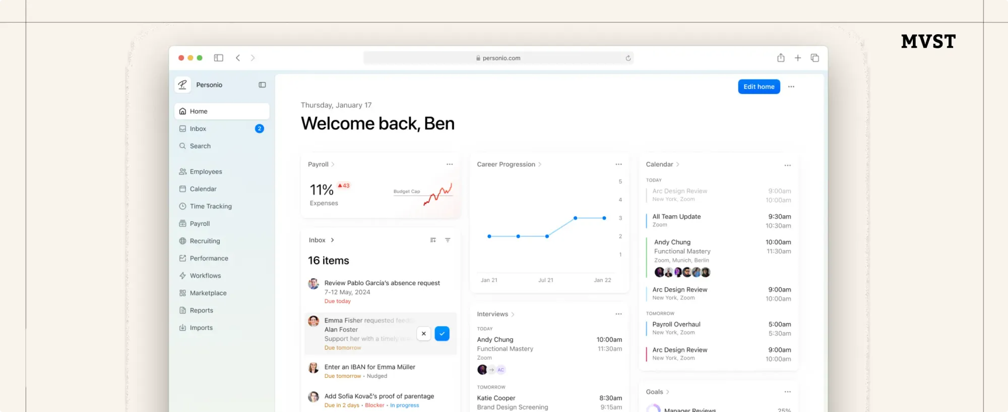
✅ Why it works:
- Personalizes UX without adding friction
- Keeps UI consistent across use cases
- Improves accessibility & responsiveness
🔍 Where to use it:
- SaaS platforms
- Role-based dashboards
- Mobile-first enterprise tools
Want UI That’s More Than Just Pretty?
We build interfaces that don’t just look good; they perform better, scale with your product, and give your users clarity from day one.
👉 Let’s bring your next UI to life

Newsroom Ideas, Design & Technology in Motion
Practical insights on AI integration, headless e-commerce, UX/UI design, and digital product development. Case studies, implementation guides, and expert perspectives from the MVST team in Munich and Barcelona.

Welcome to MVST, Marc Fermín
Ghida El BadriJun 29, 2026
Welcome to MVST, Victor Carmona Aliu
Ghida El BadriJun 29, 2026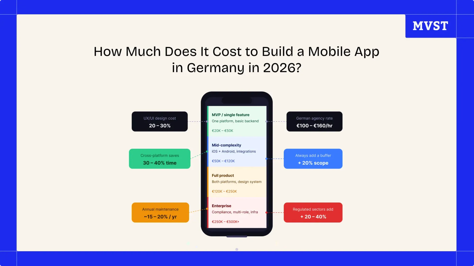
How Much Does It Cost to Build a Mobile App in Germany in 2026?
Ghida El BadriJun 17, 2026